Case Study
Delaware SBDC
The Delaware Small Business Development Center (SBDC) helps entrepreneurs and small businesses across the state with expert advice and tailored support. Their programs serve a wide range of audiences, each with its own focus and goals, but all operate under the same parent brand. The Delaware SBDC needed a visual system that allowed each program to stand out, while still feeling like part of the larger organization. We created a sub-branding system that gave each program a distinct logo and look, all built from a shared visual foundation. The result is a consistent, scalable identity system that supports clarity, recognition, and future growth.
Scope of Work
- Sub-branding System
- Logo Design
- Branded Materials & Templates
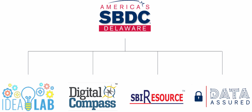
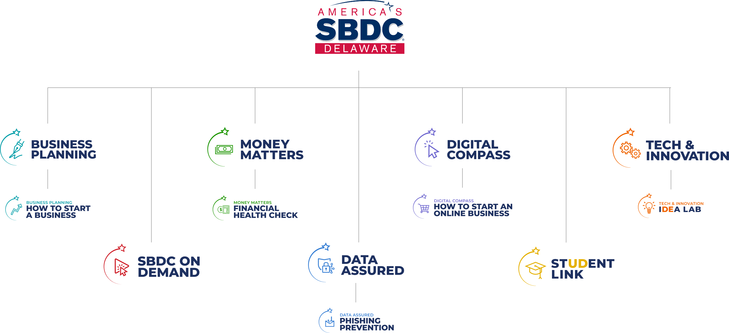
Clarifying a Fragmented Brand System
The Delaware SBDC supports a wide range of programs, each serving different needs across the state. But over time, those programs developed separate logos and visual styles that didn’t connect back to the parent brand. This made it harder for audiences to understand how everything fit together. The local chapter needed a unified design system that could organize its offerings while still allowing each program to show its individual focus.
Crafting Connection Through Design

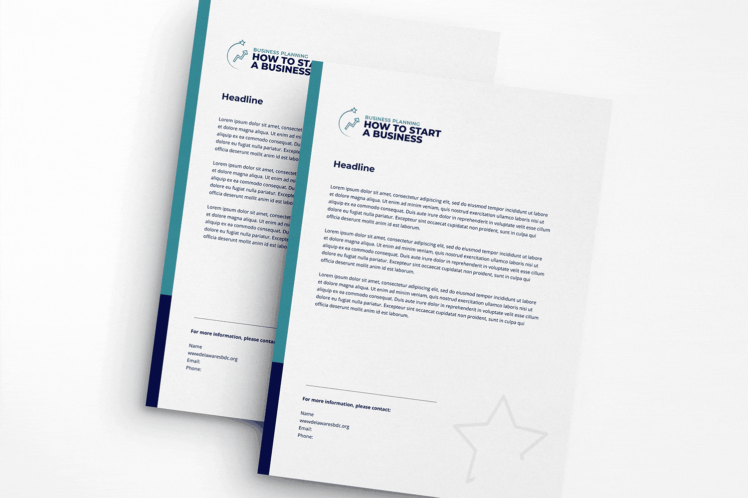
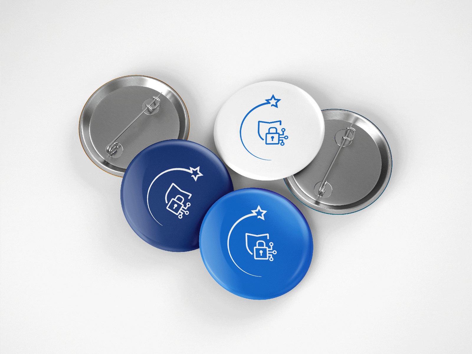
We built a flexible sub-branding system rooted in the national SBDC logo. The star and swoosh became the visual thread that tied everything together. Each program received its own custom icon and color palette, designed to match its goals and audience while still feeling like part of the larger SBDC family. To support implementation, we created logo usage guidelines and adaptable templates for each sub-brand. Everything was built to make the system easy to adopt and apply across all touchpoints.
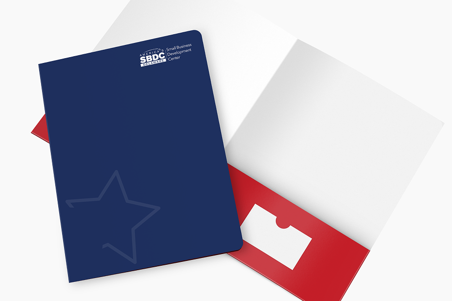
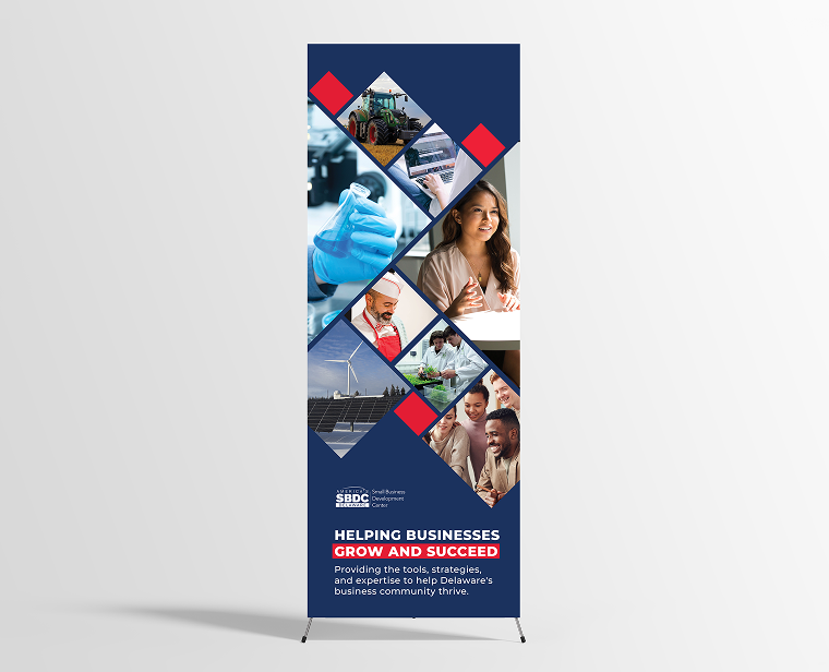
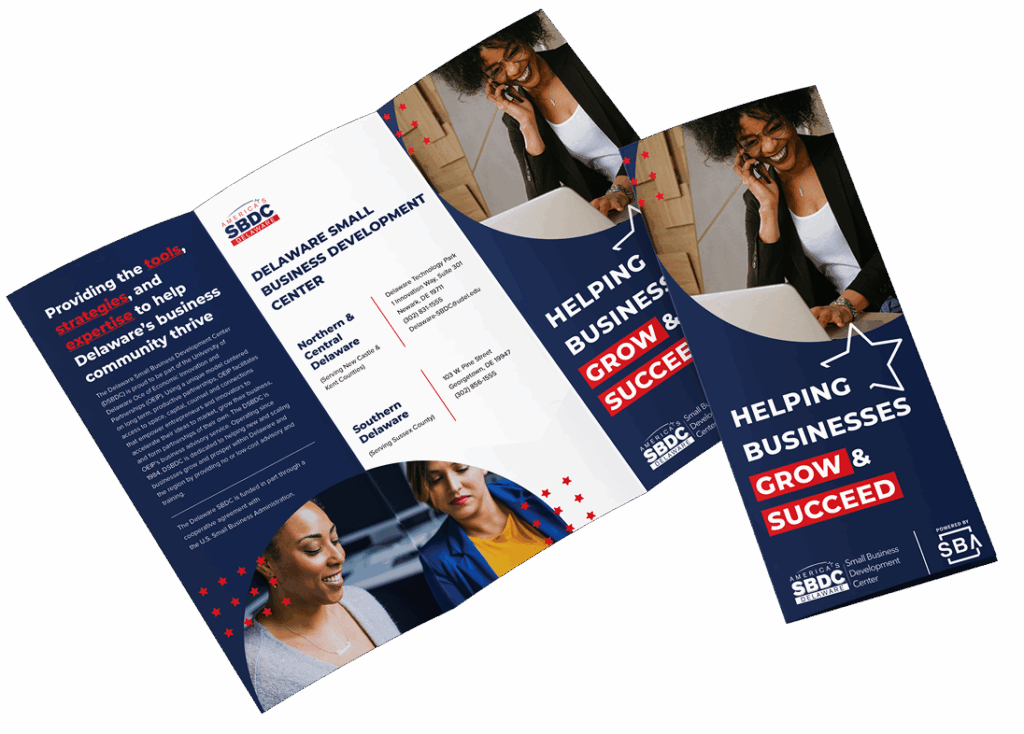
Building a Cohesive Brand in Action
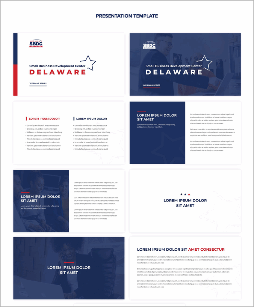
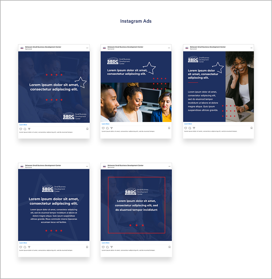
With the visual system in place, we brought it to life through branded materials for the main Delaware SBDC team. We designed brochures, flyer templates, presentation decks, and event materials like banners, tablecloths, and giveaway items. Each asset reinforced the new identity and made it easy for the team to show up consistently across the state.

A Cohesive Identity
for the Future
The Delaware SBDC now has a brand system that clearly connects its programs while giving each one room to stand out. The new structure brings clarity to the organization’s work and makes it easier for audiences to understand the full scope of what they offer. With clear templates and tools in place, the team is ready to grow while keeping communications consistent and strong.