Given that every application has different settings, you can’t control every inbox, but you can design smart.
Your audience is already drowning in emails from promotional blasts, newsletters, and shopping confirmations. And chances are, they’re reading those emails in dark mode while scrolling in bed, on their commute, or during the quiet five minutes before their next meeting.
Dark mode isn’t new, but ever since Apple rolled it out in 2018, nearly every platform has adopted the feature, including Gmail, Outlook, Apple Mail, and even Android’s native apps.
Over 40% of users view their emails in dark mode. It’s popular because it reduces eye strain, saves battery life on OLED screens, and improves accessibility for people with visual sensitivities like photophobia, ADHD, migraines, and more.
If your emails aren’t designed for dark mode, you’re actively turning people away with broken layouts, unreadable text, and a brand impression that tells your audience that the email was not made for them. In this post, we’ll cover what dark mode is, who uses it, why it matters, and how to make sure your emails look good no matter the screen.
Understanding Dark Mode
Dark mode replaces light backgrounds with dark ones and inverts text colors, often breaking layouts if they aren’t designed to be compatible with dark mode features in mind. With more users defaulting to dark mode across apps, devices, and email clients, it’s not something you can ignore.
The numbers tell the story. Back in August 2021, about 28% of users were viewing emails in dark mode. A year later, it had climbed to nearly 34%. Today, we’re looking at over 40% of subscribers reading their emails with dark backgrounds. If you’re not designing for dark mode, you’re not designing for nearly half your audience.
What Happens When You Ignore Dark Mode
Plain text emails aren’t affected by dark mode, but HTML emails are. These include structured design elements like logos, graphics, or styled text, and dark mode can change how those elements appear. That means your carefully crafted design might not look the way you intended.
And just because your email looks great in light mode doesn’t mean it translates to dark mode. Here’s what happens when you ignore dark mode:
❌ Your logo vanishes because the background it was built for no longer exists
❌ Brand colors shift or lose contrast, making your message harder to read
❌ Text that was dark on white becomes dark on dark and basically unreadable
❌ Layouts don’t hold up, and your email ends up looking broken or outdated
Ignoring dark mode means ignoring:
❌ Accessibility: Dark mode supports users with visual sensitivities and accessibility needs. If your email breaks in dark mode, you’re creating a barrier.
❌ Brand consistency: If your logo disappears or your colors look off, it breaks away at trust. Visual inconsistency makes your brand look sloppy, even when your message is solid.
❌ Readability: Low contrast or inverted elements can make your email hard to read. If it’s not easy to read, it’s easy to skip.
Every Inbox Handles Dark Mode Differently
Here’s the tricky part about designing for dark mode: it’s wildly inconsistent.
Designing for dark mode would be easier if all email clients played by the same rules, but they don’t. Some leave your design completely untouched, while others flip background and text colors automatically.
Take Apple Mail, for example. Whether a user has dark mode on or off, your email shows up exactly as you designed it. But open that same email in Gmail or Outlook on a Windows device, and suddenly you’re dealing with inverted colors, broken backgrounds, and design choices you definitely didn’t approve.
Here’s how various email clients affect dark mode, according to Email Acid:
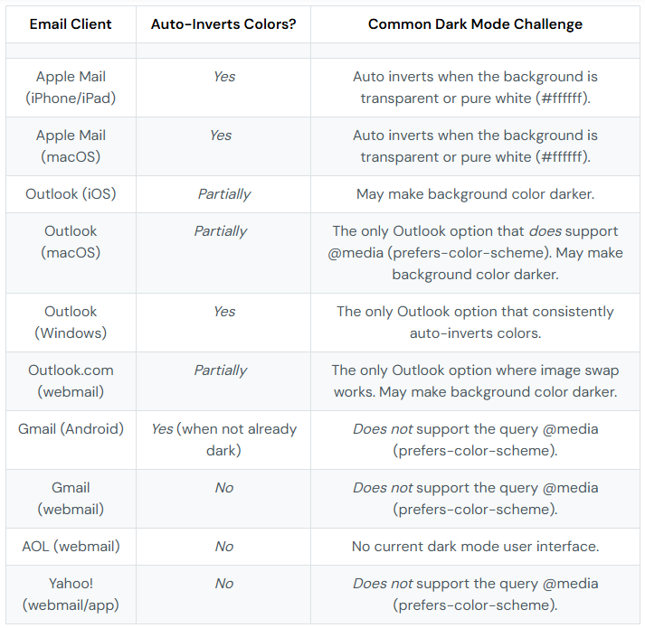
Image from Email Acid
How to Design Visuals That Hold Up in Any Mode
Here’s how to keep everything crisp, clean, and legible no matter the mode:
✅ Use solid backgrounds. Wrap your graphics in a consistent background color. It keeps things visible when the email client flips the lights.
✅ Add subtle effects. Use drop shadows, glows, or outlines to preserve graphic visibility across modes.
✅ Handle logos with care. If your brand colors aren’t flexible, don’t alter them. Instead:
- Place logos on solid background blocks
- Build them into full-width banners
- Use approved alternate color versions if your brand allows
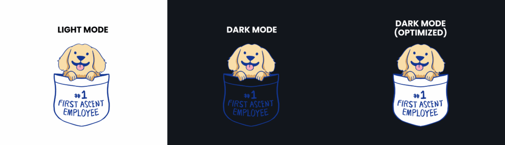
✅ Add fill colors to icons so shapes stay visible. Use saturated tones and test them in both light and dark modes to make sure the color shows.
✅ Prioritize contrast. No matter the mode, every element needs enough contrast to be readable and accessible.
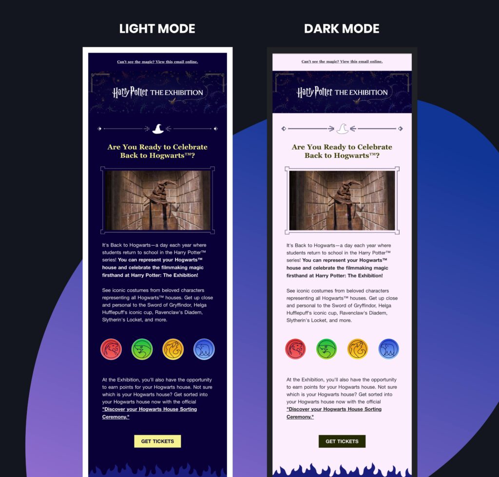
Great Emails That Work in Both Modes
Take a look at how we handled dark mode compatibility across a few client emails we designed:
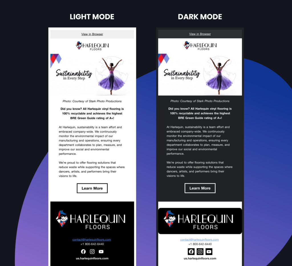
- Logos stay sharp in both light and dark mode, fully integrated into the hero section.
- Outlined graphics keep visuals clear, no matter the background.
- Icons use bold, saturated colors that hold up in any mode.
- Text colors are inverted by design, tested to stay readable on both light and dark backgrounds.
Make Sure To Test Before You Send
Every email client handles dark mode differently, which is why testing is everything. You have to design smart and test smarter.
Here’s how to do it right:
- Turn on dark mode on all your devices (yes, desktop and mobile)
- Send test emails to yourself and your team
- Check your layout across different platforms and inboxes
- Use tools like:
- Litmus: A go-to platform for email QA and rendering previews. Litmus lets you test how your email looks across dozens of email clients and devices, including dark mode environments.
- Email on Acid: Email on Acid includes dark mode testing in their automated Campaign Precheck tool, plus, you can also check how many of your subscribers are opening emails in dark mode with their Advanced Email Analytics.
You Can’t Control the Inbox, But You Can Design for It
Given that every application has different settings, you can’t control every inbox, but you can design smart. The goal: emails that work no matter the theme, device, or client.
Get ahead of the quirks and make sure your emails show up right the first time. Think of it as insurance for your design so your content looks polished and professional in every inbox. By making your emails work for all users, whether they’re in full sunlight or reading under the covers, you’re showing up with professionalism. And that’s exactly the kind of impression worth investing in.
Let’s talk about making sure your emails show up the way you intended.